Modern web design trends are evolving rapidly and continuously, as designers constantly experiment with different styles, techniques, textures and colours. Concurrently, a few renowned web styles still remain prevalent, such as flat illustrations with many colours and minimalistic designs. Now that we enter into the mid half of 2020, let’s explore the modern web design trends that are taking the internet by storm.
Dark But Not Brooding Mode
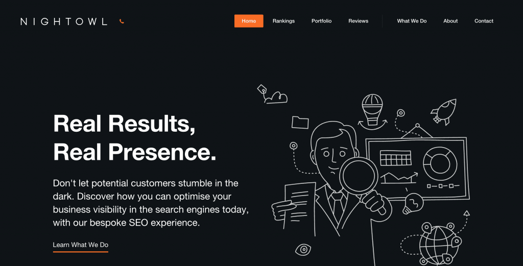
As more and more sites play around with designs that have little to almost no colour at all, dark mode web designs seem to be taking the world by storm. They appear modern, are light on the eyes and allow other colours and design elements to stand out. In addition, they are more suited for organic light-emitting diode (OLED) screens, which help to conserve power and improve the lifespans of screens, without compromising the beautiful aesthetics. Also, many users utilise the “dark mode” feature on their smartphones, emails and apps, so it’s only fitting that websites capitalise on this, to better engage visitors.
Source: NightOwl.sg
Trendy Colour Schemes
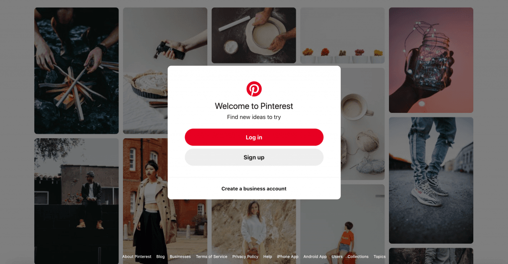
Trendy and captivating colour schemes have played an important role in web design, with shiny and bright colours taking the lead. To achieve the bright effect, glowing neons and highly saturated colours have been paired with shades that are darker and muted. Apart from that, trendy colour pairings that have been invading our lives in aspects such as social media, music and clothings, have steadily found their way into website designs. A very common example is the pairings of blue colour with pale pink scheme, that has been popularised by websites/apps such as Pinterest and Instagram. Other popular examples include jewel schemes with green and purple colours, earthy schemes with brown, green, tan and wood textures and colours, and pearl schemes which blend pastel colours fluidly together, projecting a realistically metallic look.
Source: Pinterest.com
Wild White Space
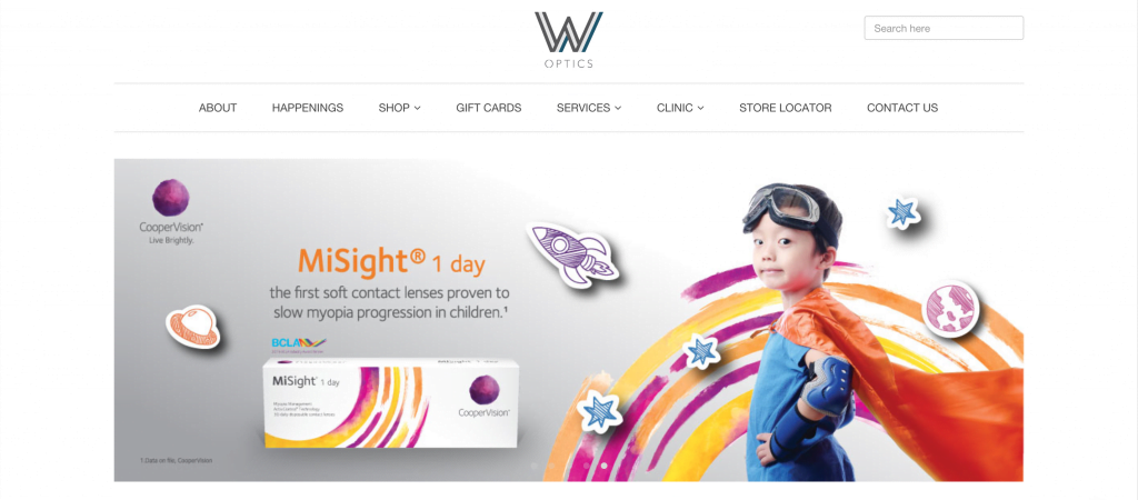
Many modern web designs have shifted towards solid structures, and experimenting with innovative ways to utilise large amounts of white space on websites. This provides a platform to jump off from, and gives their designs ample stability and structure. Many websites with wide frames of white space have popped up and we can understand why. Visuals are able to stand out prominently due to the large amounts of space allocated to each element on the page. In addition, websites that have neatly ordered frames help to separate various parts of a page according to their importance. WOptics is an example of a website that utilises white space to highlight their content, with great effect.
Watch It Now In 3D
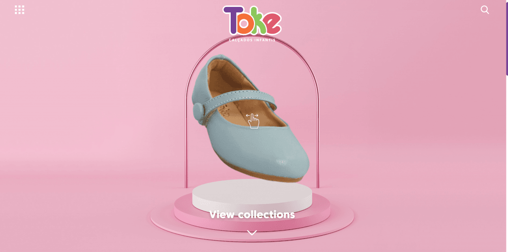
People have always been mesmerised by 3D visuals, and it has been around for decades now, but what prevented it from exploding into the web design scene in previous years, were the lack in technological advancement and its once hefty price tag. Today, 3D is more affordable and you do not need state of the art equipment to use it, thus, paving the way for more of its use in modern web designs. 3D visuals help to add more depth and develop a stronger sense of realism for web designs. With 3D, the boundaries between reality and digital space are broken, thus enabling websites to draw and immerse users in the content, and encouraging them to stay longer. Some of the noteworthy 3D modern web designs surprise users with unexpected content such as the sideways scroll for viewing different shoes on the Toke website.
Source: Toke.com.br
Animate My World
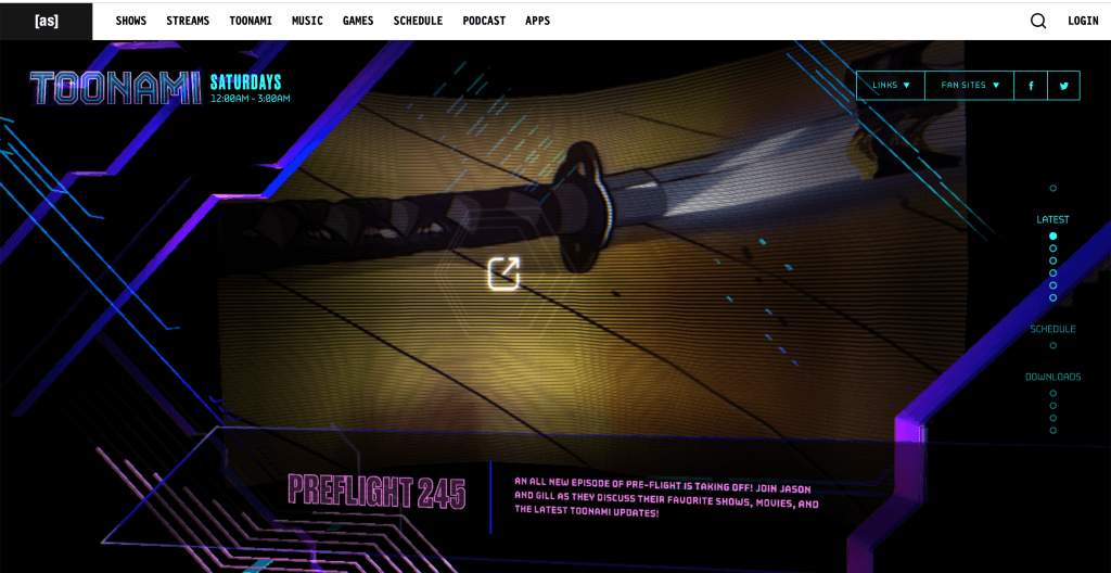
Virtually every website appears to have a particular type of animation running on it, so what then makes animation trendy in 2020? It is actually animation that appears fluid-like and one that is initiated by an action from a website’s visitor. Due to its smooth nature and impeccable timing, this kind of animation is utilised for transitioning video elements, or general animation to aid in drawing users into the web design. Toonami’s website utilises this form of animation almost flawlessly, as an anchor to initiate extra motion to elements on the screen and encourage users to ultimately click on various sections, to get more information.
Some of the biggest modern web design trends that we’ve seen so far in 2020 involve dark modes, trendy colour schemes, white space, 3D and animations. 2020 is only halfway through, but it is poised to be an excellent year for modern web design and fans alike, so we can’t wait to see more of these designs take centre stage as we make our way into the next decade.
